visual sales
reporting
highlight
product facings
the visual sales reporting feature colors product faces according to 4
kinds of analysis.
● threshold
analysis
highlights according to a 'threshold' value for a field
for example, face are colored green if they have sales
less than a certain value and colored red if they exceed
that value.
●
quadrant analysis
highlights according to the comparison any two fields
for 4 combinations of over or under a value.
● group
comparison
highlights according to one field and breaks it into
groups of equal or unequal values. you can use this to
show the top and bottom 10% of performing products for
example
●
general compare
this lets you compare multiple fields to multiple
values. this has tremendous flexibility in letting you
highlight according to your own rules.
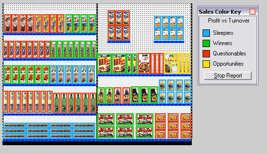
quadrant analysis
the analysis information is displayed on the plan by coloring
product faces according to your choice of colors. here's a
typical quadrant analysis visual sales report preformed on our
demo plan.

this compares the profit and product turnover. product faces are
colored accordingly and the sales color key identifies
what the colors mean. while we have 10 evenly divided groups, we
show only the top and bottom 2 groups. product faces in the
other groups are just colored black.
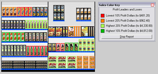
profitability grouping
here's another example
that divides the product profit amount into 10 even groups. we
show the top 2 groups, which represent products with the top 10%
and top 20% profitability. we also show the two lowest groups,
product with the lowest 10% and 20% profit.

again, the sales color key explains the meaning of the
colors. in addition, we show the value amounts calculated to be
the top and bottom percentage amounts.
the visual sales reporting module lets you easily identify
products that are selling well and those that are not.
|


